Uniabroad
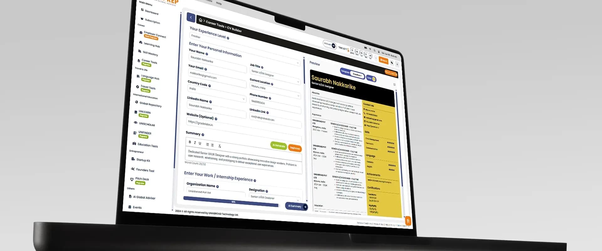
Uniabroad is an innovative ed-tech organization facilitating global education. Alongside my core work on Uniprep, I led a 2-member design team as the Senior UI/UX Designer, owning the end-to-end design process to elevate the brand and platform usability.

Strategic Kickoff
Each major phase of the project began with strategy alignment meetings involving the CEO and team lead. Our goal was clear: bridge the gap between business objectives (lead capture, operational efficiency) and user needs (clarity, trust, speed).
During these sessions, we defined user goals, business needs, and feature priorities. I translated these abstract requirements into early design directions, mapping out the core architecture before diving into visual design.
Agile Communication Loop
To avoid the traditional "waterfall" trap where design operates in a silo, I maintained direct, constant communication with the CEO and the technical lead. Through Figma comments, Slack, and regular check-ins, we established a fast feedback cycle that kept stakeholders closely involved and prevented expensive rework down the line.
The Feedback Loop
Continuous validation to ensure business and user goals align perfectly before development.
Business Goals
Figma Prototyping
Feasibility Check
Design Presentations & Iteration
I presented design concepts at every critical milestone. Starting from low-fidelity wireframes that locked in the structure and user flows, we progressed to high-fidelity, interactive mockups.
This phased presentation approach ensured that key functionality decisions were validated during prototyping, allowing the team to experience the platform exactly as a user would before committing it to code.



Analytics & Decision-Making
Initial design decisions were grounded deeply in usability principles and brand direction. Once reviewed by the team lead, these decisions were actively refined after thorough user testing rounds and internal QA.
Metrics Tracked
We closely monitored bounce rates, landing-to-form-submission conversions, and time spent on key CTA sections to pinpoint friction.
User Insights
Direct engagement during usability testing revealed that transparency, perceived speed, and absolute clarity were the primary trust indicators for students.
Research Synthesis
Key findings from usability testing and analytics, mapped before any redesign decisions were made.
Pain Points
- Application forms too long, no progress saving
- Students leaving to research courses externally
- High bounce on landing pages
- Unclear CTA hierarchy throughout
User Goals
- Find and compare universities easily
- Understand visa and cost requirements
- Track application status in one place
- Trust the platform before committing
Design Opportunities
- Step-by-step application wizard
- In-app program discovery module
- Progress saving with visual indicators
- Trust signals on landing pages
Constraints
- Angular + Bootstrap tech stack
- 12-person dev team, parallel builds
- Legacy data schema limitations
- Tight sprint cycles with CEO reviews
Impact of My Work
The iterative approach and direct integration with business metrics transformed the Uniabroad digital footprint, delivering strong outcomes for both students and internal staff.
Achieved by redesigning the application flow to eliminate cognitive overload and unnecessary platform switching.
Driven by the step-by-step wizard pattern and in-app program discovery reducing mid-flow abandonment.
The 60+ component design system eliminated ambiguity at the Figma-to-Angular boundary, making every sprint significantly faster for the dev team.