QCon
A comprehensive digital reimagining for QCon. Designed to bridge the gap between corporate authority and modern user accessibility, establishing a foundation of absolute trust from the very first scroll.
Project Context & History
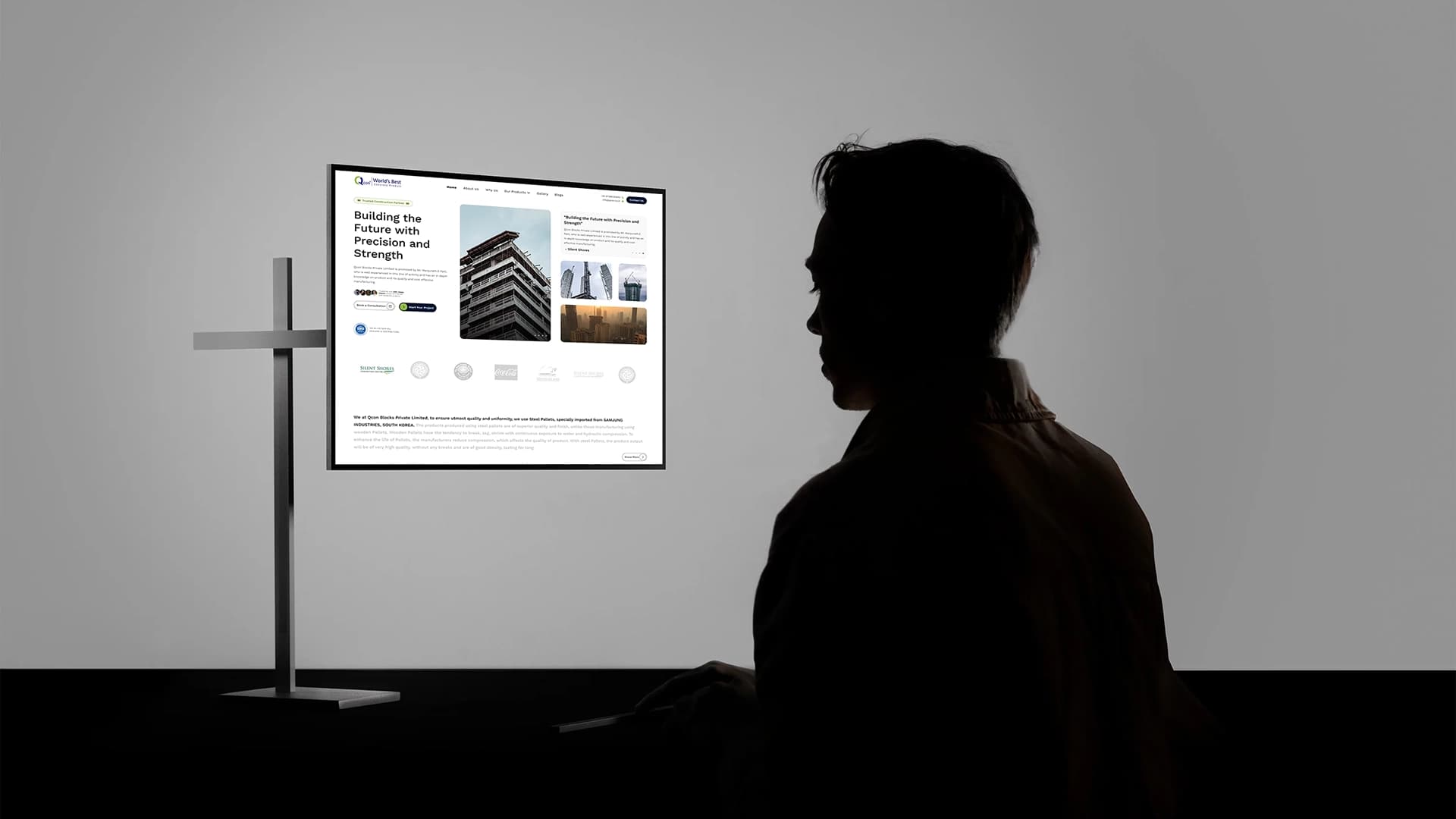
During my tenure as Lead UI/UX Designer at UNIABROAD, a high-stakes partnership was proposed with QCon. To secure this partnership, we needed to present a vision of how QCon's digital presence could be elevated to match their operational scale.
I spearheaded the design initiative, crafting a bespoke web experience from the ground up. The goal wasn't just to make it "look good," but to architect a platform that effectively communicated their services, built immense trust, and funnelled users toward engagement. Although the business contract ultimately stalled, the designs themselves were universally praised and approved by the QCon executive team.
Design Philosophy
Corporate websites often fall into the trap of being either too dry (lacking visual engagement) or too flashy (compromising on professionalism and readability). My approach for QCon struck a balance:
Leveraged heavy padding and margins to let content breathe, significantly reducing cognitive load for B2B users scanning for information.
Designed with a clear visual hierarchy where primary CTA buttons hold maximum contrast, guiding the user journey seamlessly.
The UX Decision Framework
Every visual decision flowed through three gates before reaching the canvas.
What must QCon achieve?
How does the journey serve it?
What is the exact UI treatment?
Deep Dive: Anatomy of the Homepage
The homepage acts as the digital lobby for QCon. I structured it as a continuous narrative, moving users from high-level value propositions down to specific offerings and social proof. Here is a breakdown of the UX decisions behind each section.
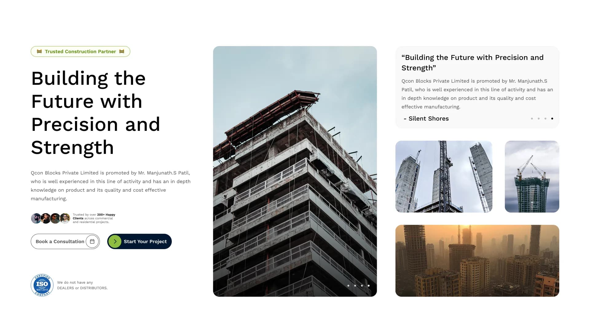
1. Navigation & Hero
The Goal: Immediate orientation and authority.
The navigation is intentionally minimal, preventing choice paralysis. The primary CTA ("Get a Quote" or "Contact") is visually isolated. The Hero section utilizes high-contrast typography against rich imagery, ensuring the core value proposition is the first thing a user reads without visual competition.

2. Immediate Social Proof
The Goal: Establish credibility instantly.
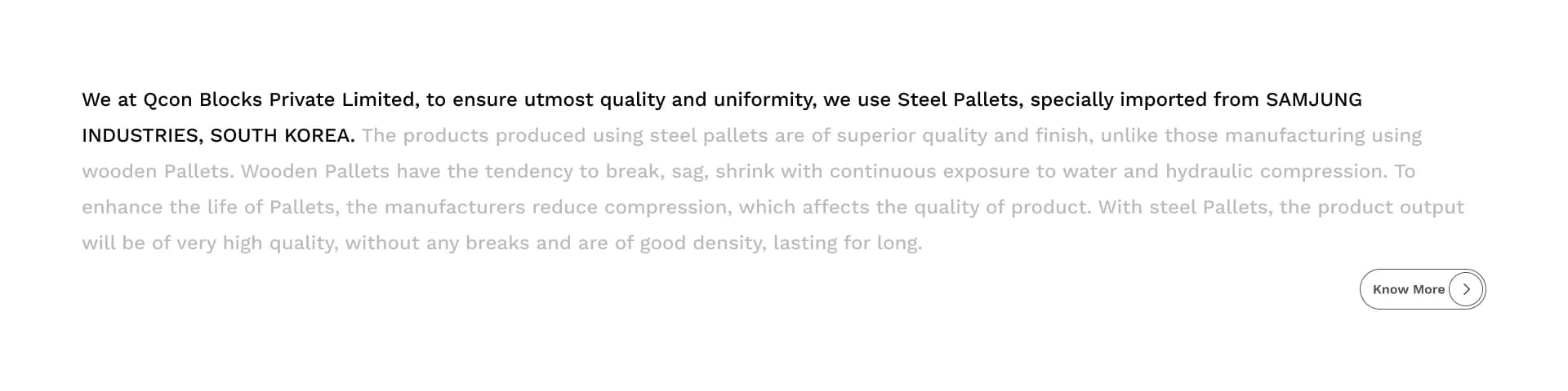
Right beneath the fold, I placed the Client/Partner logos. In B2B and corporate environments, trust is currency. By converting these logos to grayscale, they add immense credibility without clashing with the brand's primary color palette.

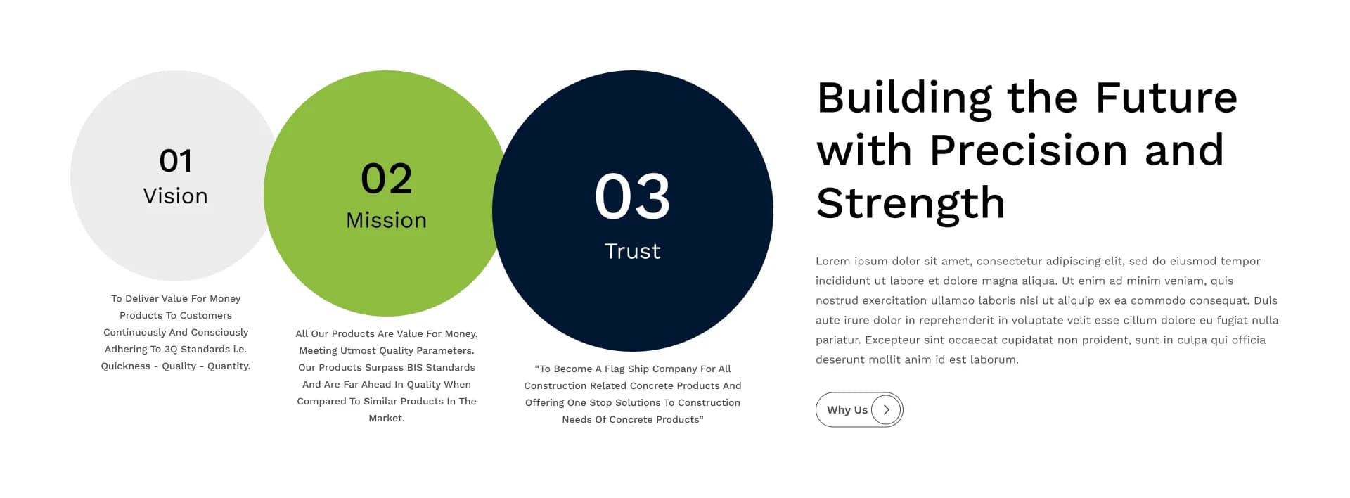
3. Humanizing the Brand
The Goal: Connect on a human level before selling.
The About and Mission sections use asymmetry and overlapping image layouts to break the rigid corporate grid. This adds a subtle modern touch, while the typography is strictly constrained to comfortable line lengths (60-75 characters) to maximize readability.
4. Scannable Solutions
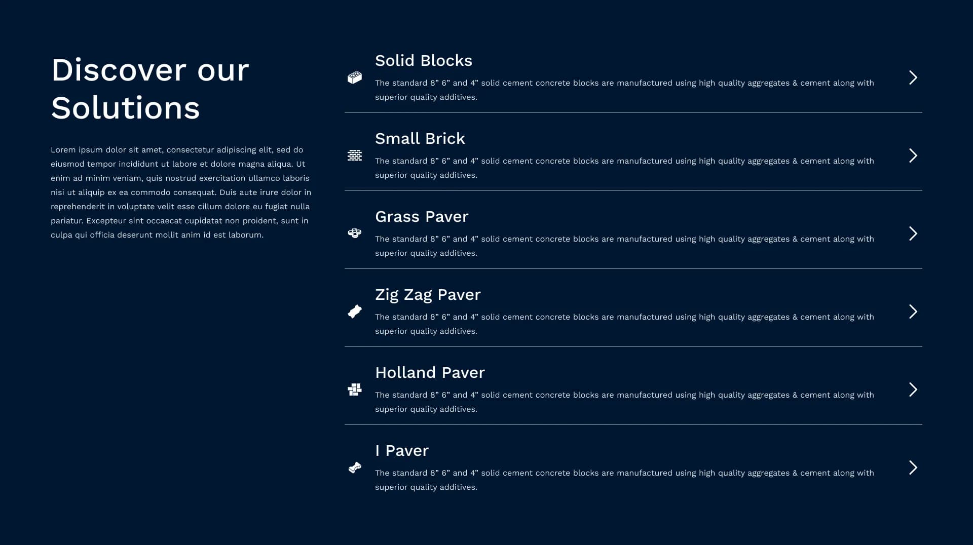
The Goal: Allow users to self-segment quickly.
Instead of a wall of text detailing services, I utilized a modular card-based layout. Paired with clear iconography, users can instantly scan and identify the specific solution relevant to their business needs. Hover states (micro-interactions) provide visual feedback, making the interface feel responsive and alive.
5. Engagement & Content
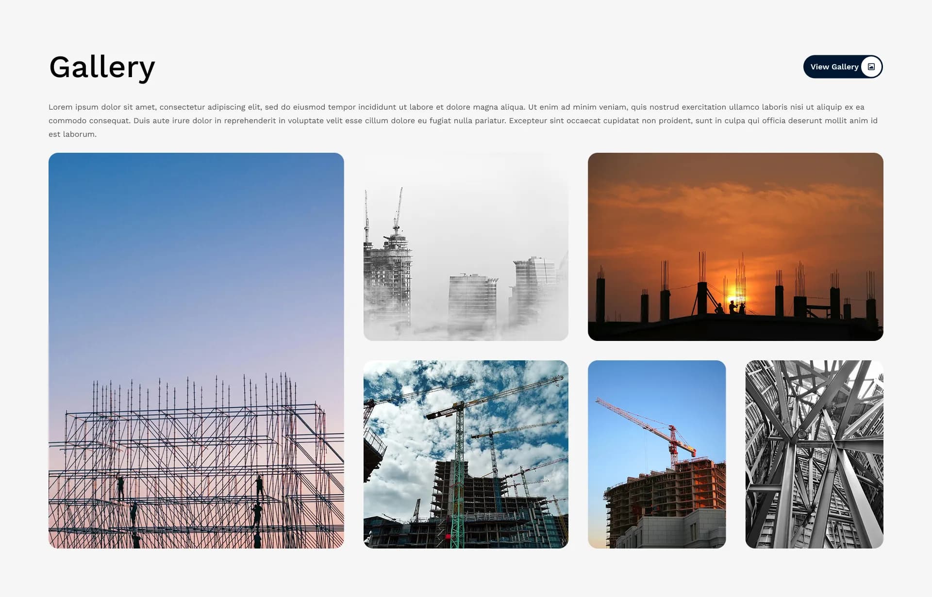
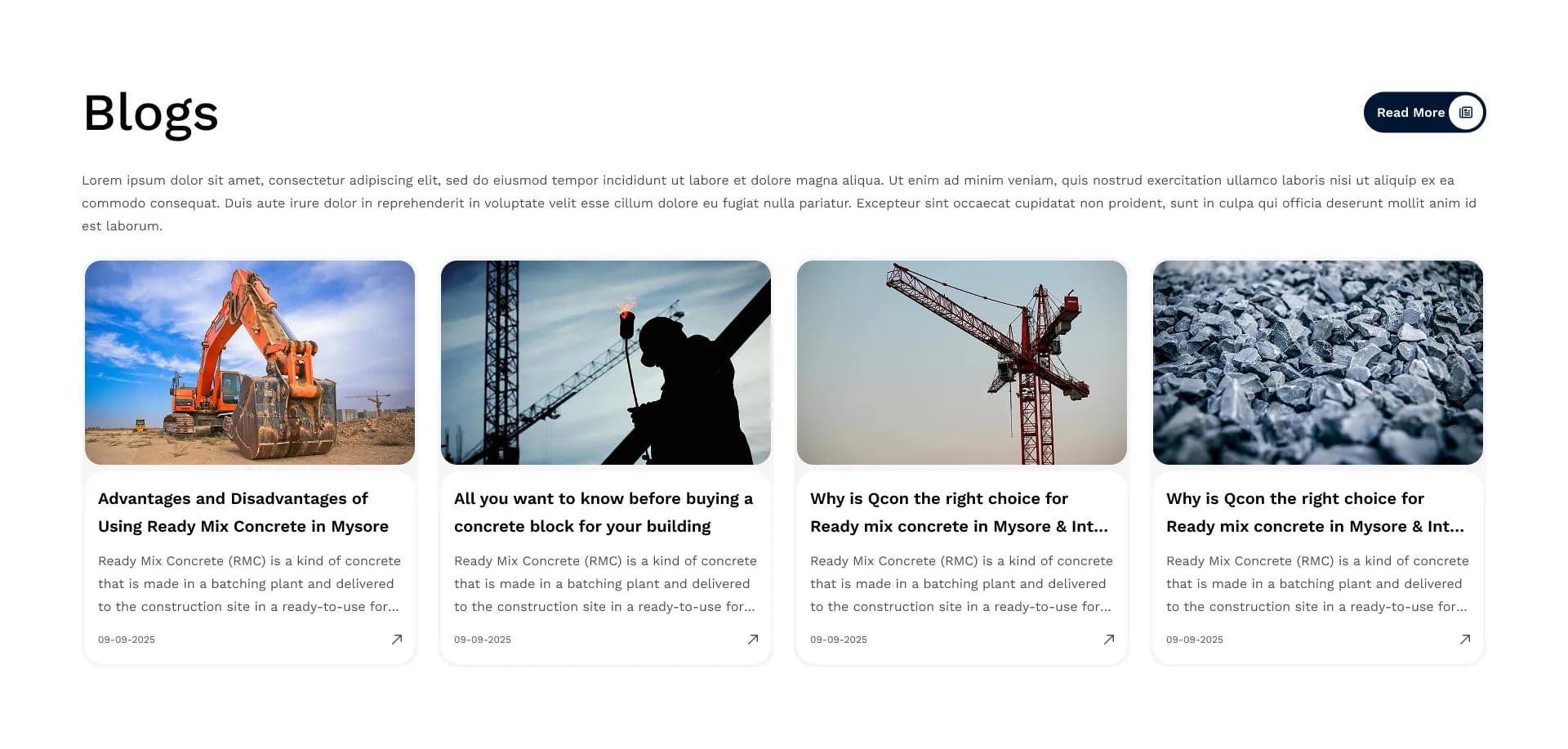
The Goal: Demonstrate active industry presence.
The Gallery and Blog sections serve as proof of work. Using an image-heavy grid for the gallery creates visual interest, while the blog layout prioritizes headlines and publish dates to signal that QCon is actively publishing thought leadership.
6. The Final Push
The Goal: Prevent dead ends in the user journey.
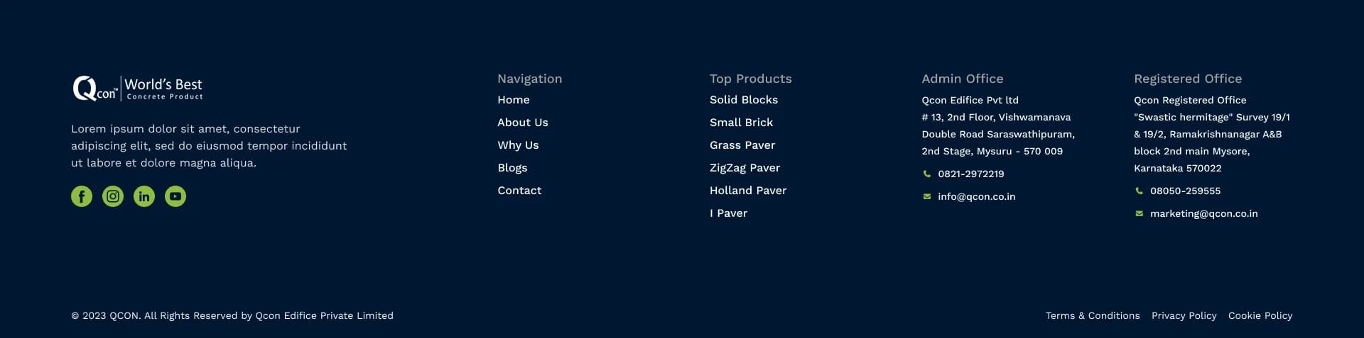
A robust website never leaves a user wondering what to do next at the bottom of a page. A high-contrast CTA section paired with a clear, interactive map provides zero friction for users ready to reach out. The footer is organized into clear columns acting as a secondary navigation system.


Stakeholder Approval Journey
Corporate design projects rarely succeed without structured stakeholder management. For QCon, I built a clear approval pipeline that kept decision-makers aligned at every stage — which is why the designs were approved without significant revision requests.
Design Brief
Consolidated business objectives, audience personas, and technical constraints into a single shared brief reviewed by both UNIABROAD and QCon leadership.
Internal Review
UNIABROAD leadership reviewed preliminary wireframes before any visual polish was applied, catching directional issues before they became expensive to fix.
High-Fidelity Iterations
Two rounds of full-color, pixel-perfect revisions incorporating stakeholder feedback on typography, imagery tone, and CTA placement.
Client Approval
The QCon executive team reviewed the complete design suite and approved it outright, validating that the UX-first strategy had successfully translated business goals into design.
Extending the Design System
The visual language established on the homepage was carefully extended to the internal pages. This ensured that no matter where a user landed, the experience remained cohesive, professional, and intuitive.
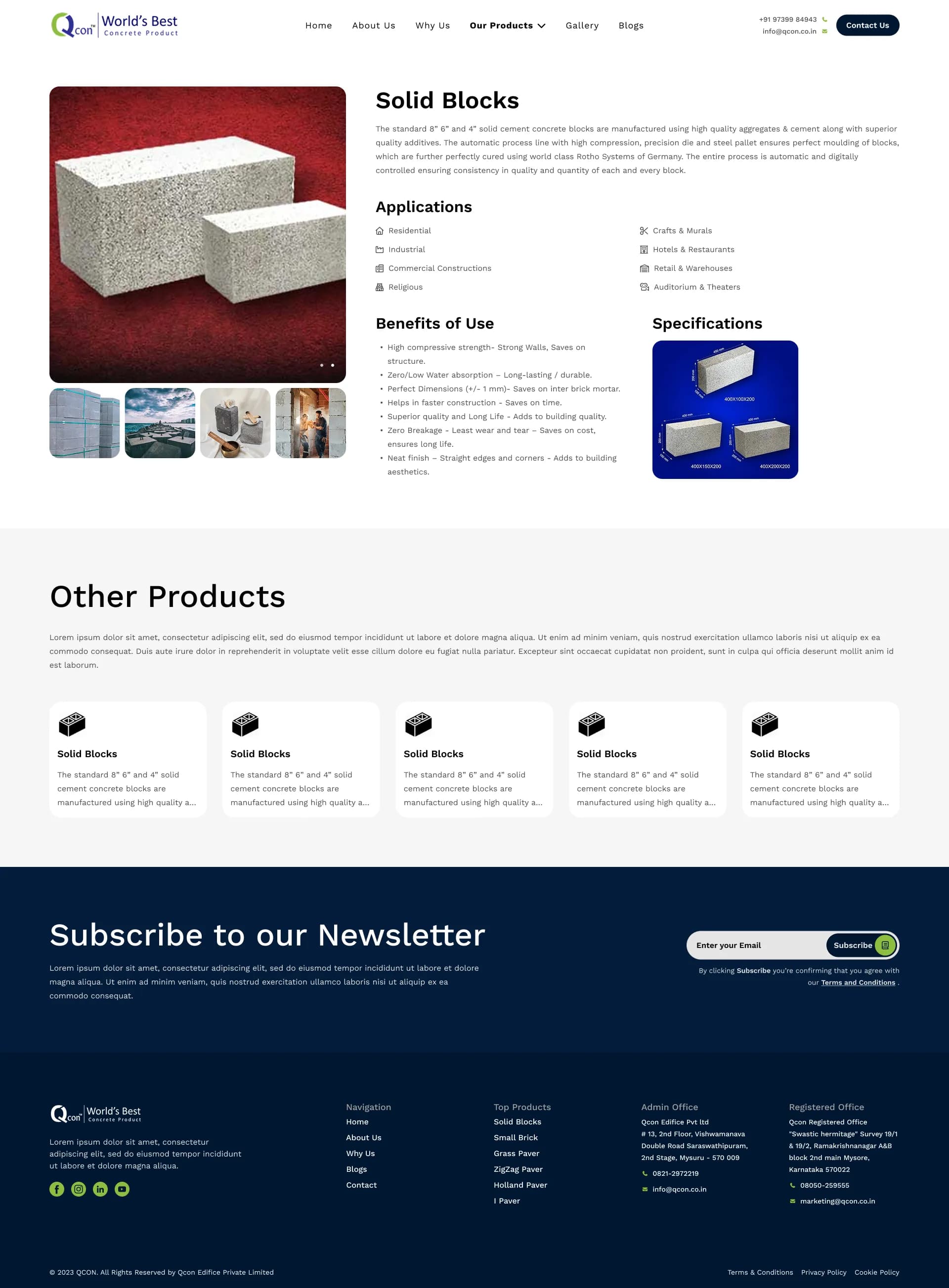
Products & Offerings
Detailed product pages were designed to balance technical specifications with marketing copy. The layout ensures technical buyers find what they need without overwhelming casual browsers.
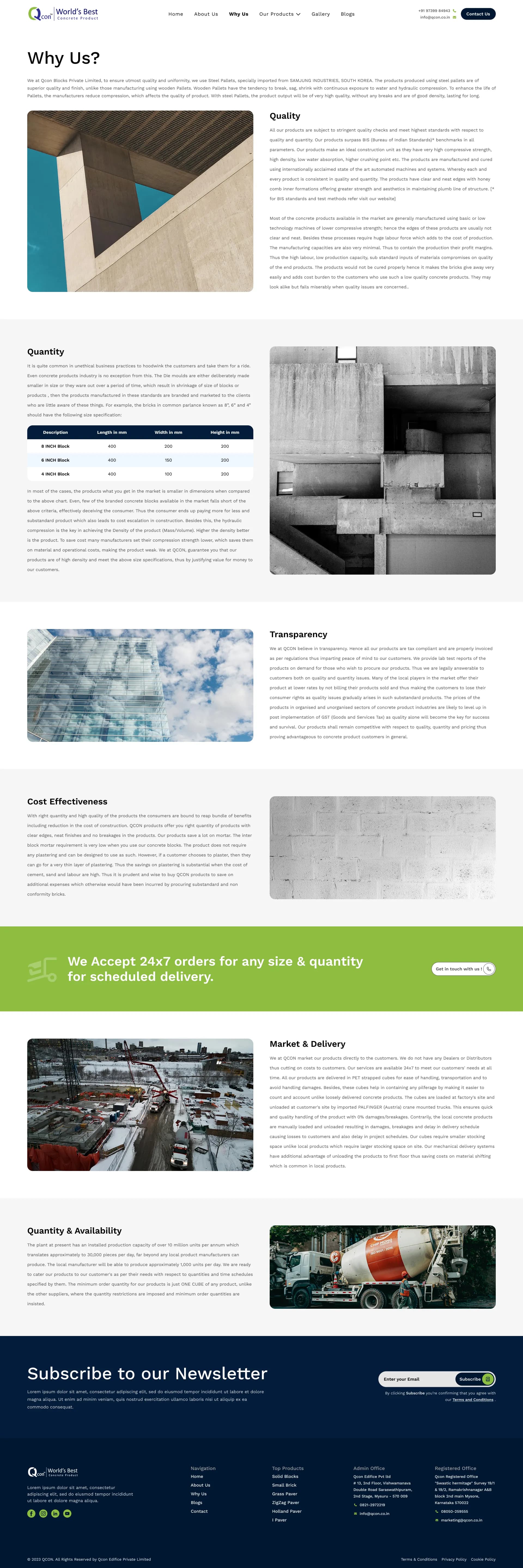
Why Choose Us
A dedicated page focusing purely on the company's USP (Unique Selling Proposition). Visual data and succinct bullet points replace long paragraphs to respect the user's time.
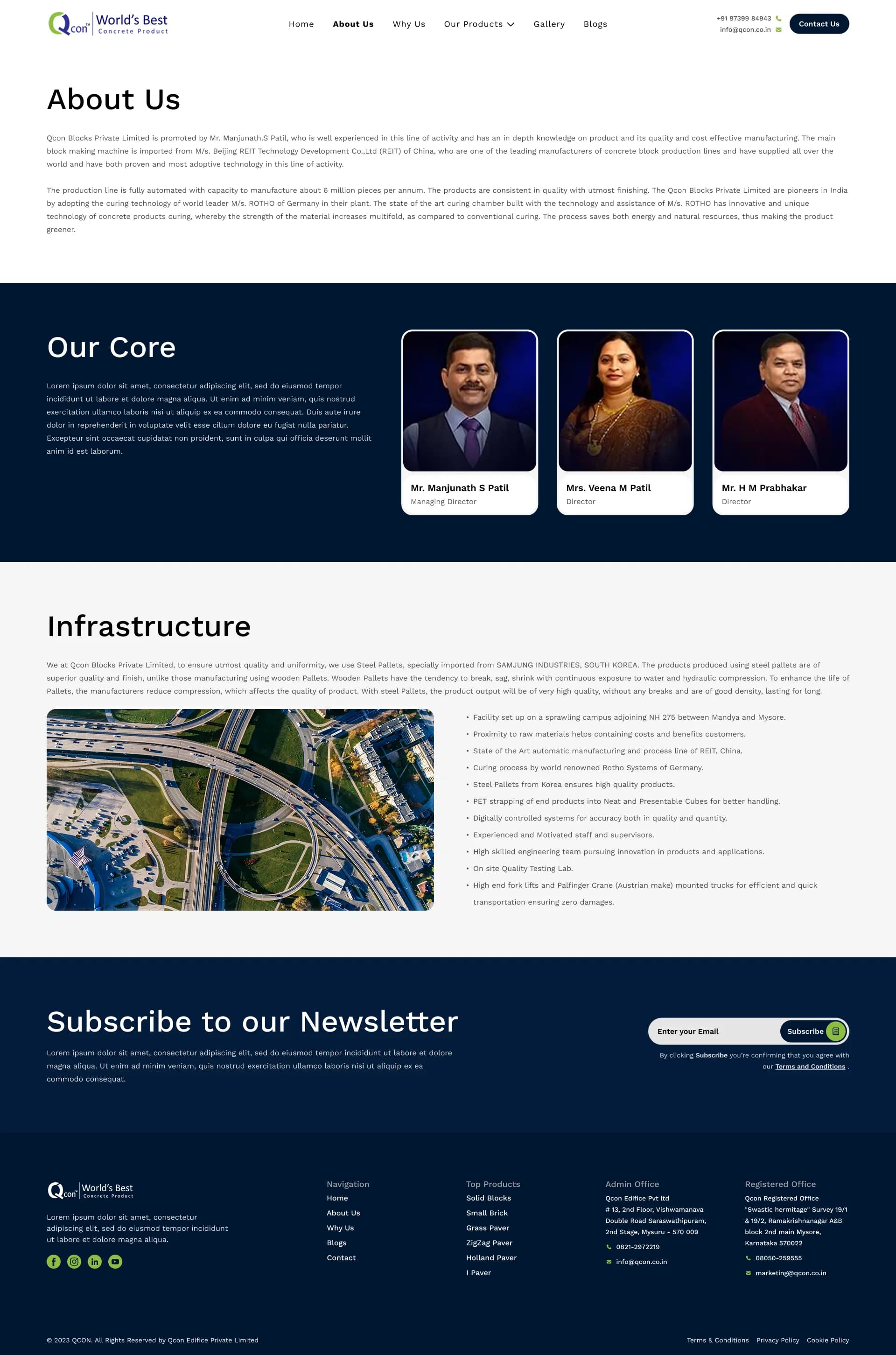
Corporate Identity & Content
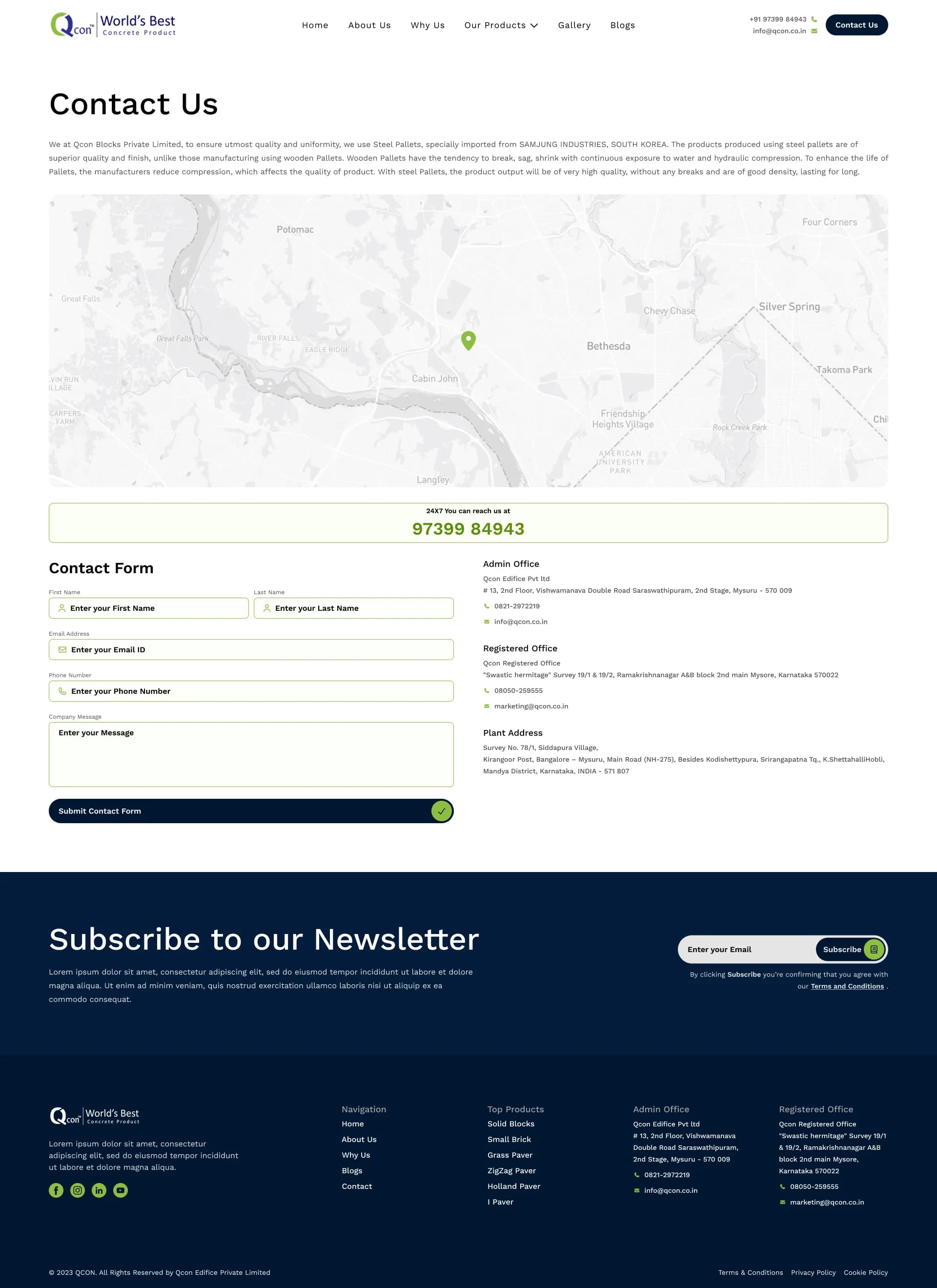
The About page dives deeper into the company's legacy, while the Contact page streamlines the inquiry process, prioritizing ease-of-use in form design.
Interactive Prototype
Explore the full interactive Figma prototype below.
Outcome & Reflection
Achieving full client approval on this design concept without extensive revisions proved the effectiveness of leading with a UX-first strategy. By deeply understanding the corporate audience, I was able to deliver a UI that didn't just look visually striking, but functionally solved the business's communication problems.
While the business partnership didn't finalize, this project remains a strong benchmark in my portfolio for how to execute high-end corporate web design efficiently.