
Tamil Economic Conference
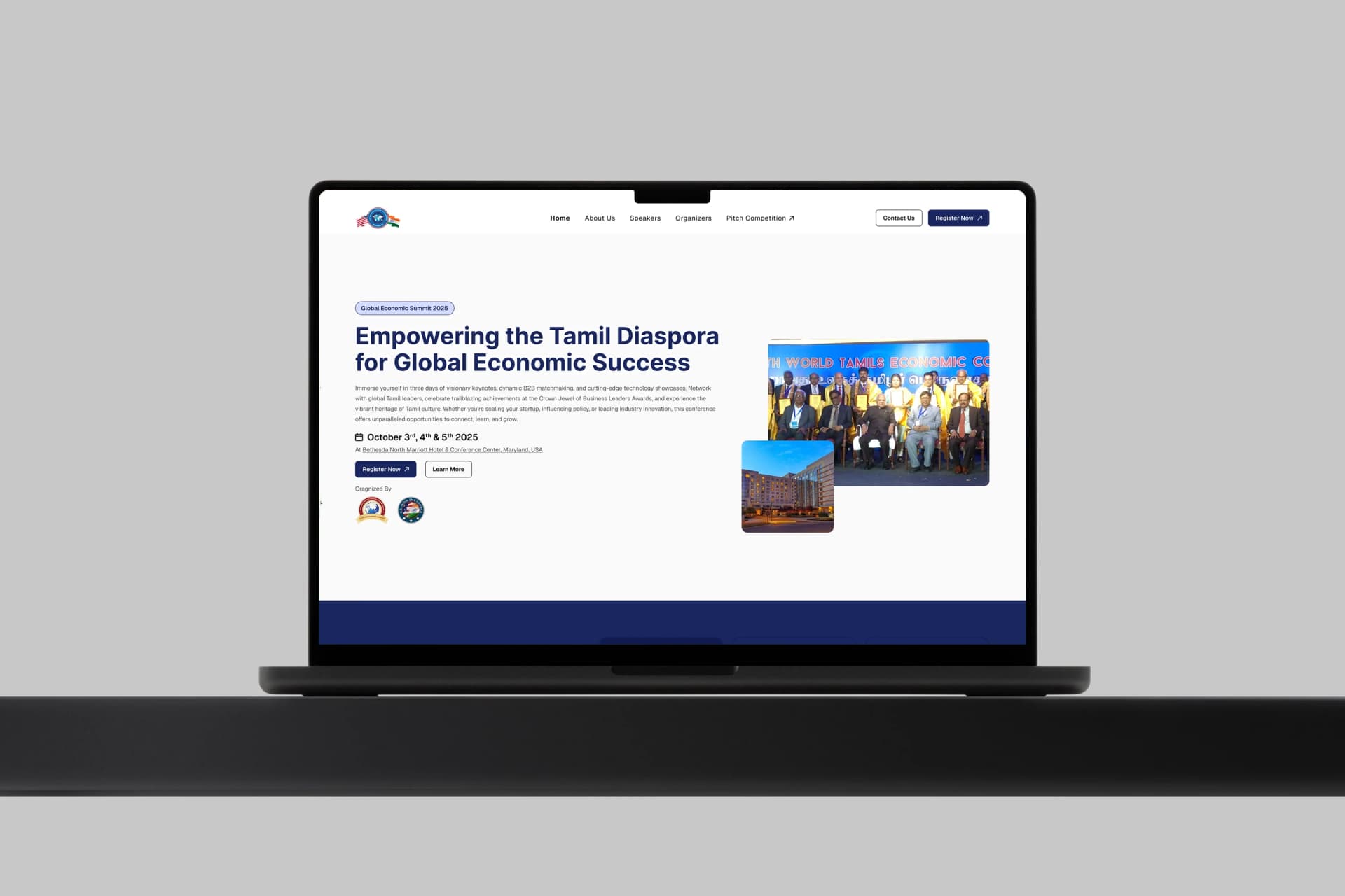
A comprehensive digital reimagining for Tamil Economic Conference. Designed to bridge the gap between corporate authority and modern user accessibility, establishing a foundation of absolute trust from the very first scroll.
Project Context & History
During my tenure as Lead UI/UX Designer at UNIABROAD, a high-stakes partnership was proposed with the Tamil Economic Conference. To secure this partnership, we needed to present a vision of how their digital presence could be elevated to manage a large-scale international event.
I spearheaded the design initiative, crafting a bespoke web experience from the ground up. The goal wasn't just aesthetics, but to architect a platform that effectively communicated event schedules, highlighted speakers, built trust, and funnelled users toward ticket registration. Although the business contract ultimately stalled, the designs themselves were universally praised and approved by the executive committee.
Information Architecture & User Flow
Event websites have a unique challenge: they must serve different user archetypes (attendees, sponsors, speakers) simultaneously. The architecture was designed to funnel all these segments efficiently without overwhelming them with complex sub-menus.
1. The Hook (Hero)
Event Dates, Location & Primary Registration CTA
2. Establishing Context
About the Event & Key Themes
3a. Agenda
Program
3b. Authority
Committee
3c. Backing
Sponsors
4. Conversion
Footer Navigation & Final Registration CTA
Design Philosophy
Conference websites often suffer from visual clutter—too many sponsors, too many speakers, and a confusing schedule. My approach for the Tamil Economic Conference was to enforce rigorous spacing and a cultural-yet-modern aesthetic.
Leveraged heavy padding and margins to let content breathe, significantly reducing cognitive load for B2B users scanning for information.
Designed with a clear visual hierarchy where primary CTA buttons hold maximum contrast, guiding the user journey seamlessly.
The UX Decision Framework
Every visual decision flowed through three gates before reaching the canvas.
What must Tamil Economic Conference achieve?
How does the journey serve it?
What is the exact UI treatment?
Deep Dive: Design Anatomy
The design was structured to establish immediate authority while keeping information easily scannable and accessible. Below is a breakdown of the key interfaces created for this project, explaining the strategic 'why' behind the pixels.
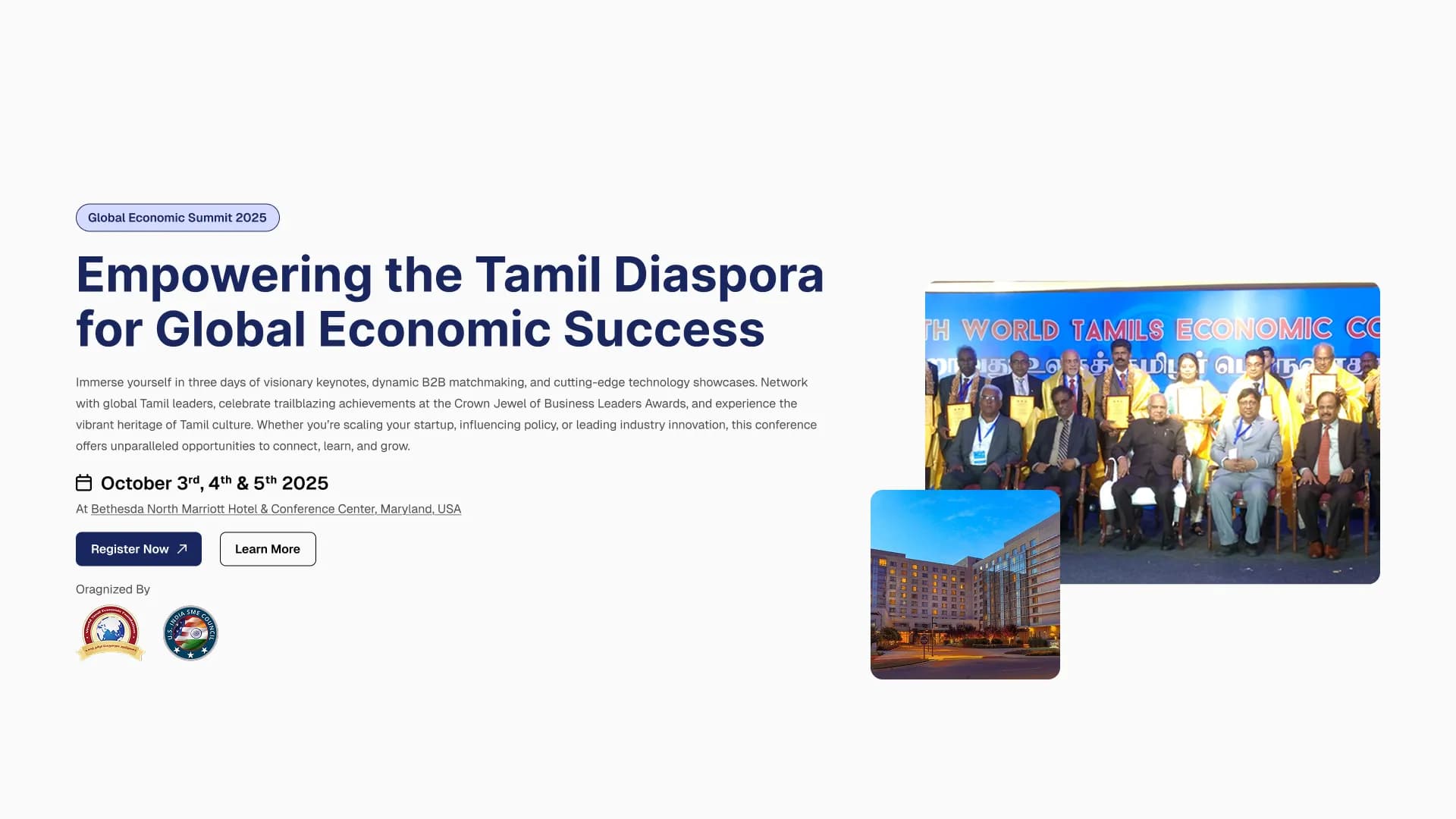
1. First Impressions & Navigation
Event attendees need immediate confirmation of the dates, location, and how to register. The sticky navigation ensures these critical touchpoints are always accessible. The Hero section utilizes a bold, culturally resonant color palette while maintaining strict typographical hierarchy to direct the eye straight to the primary CTA.

2. Context & Program Clarity
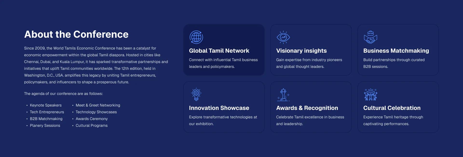
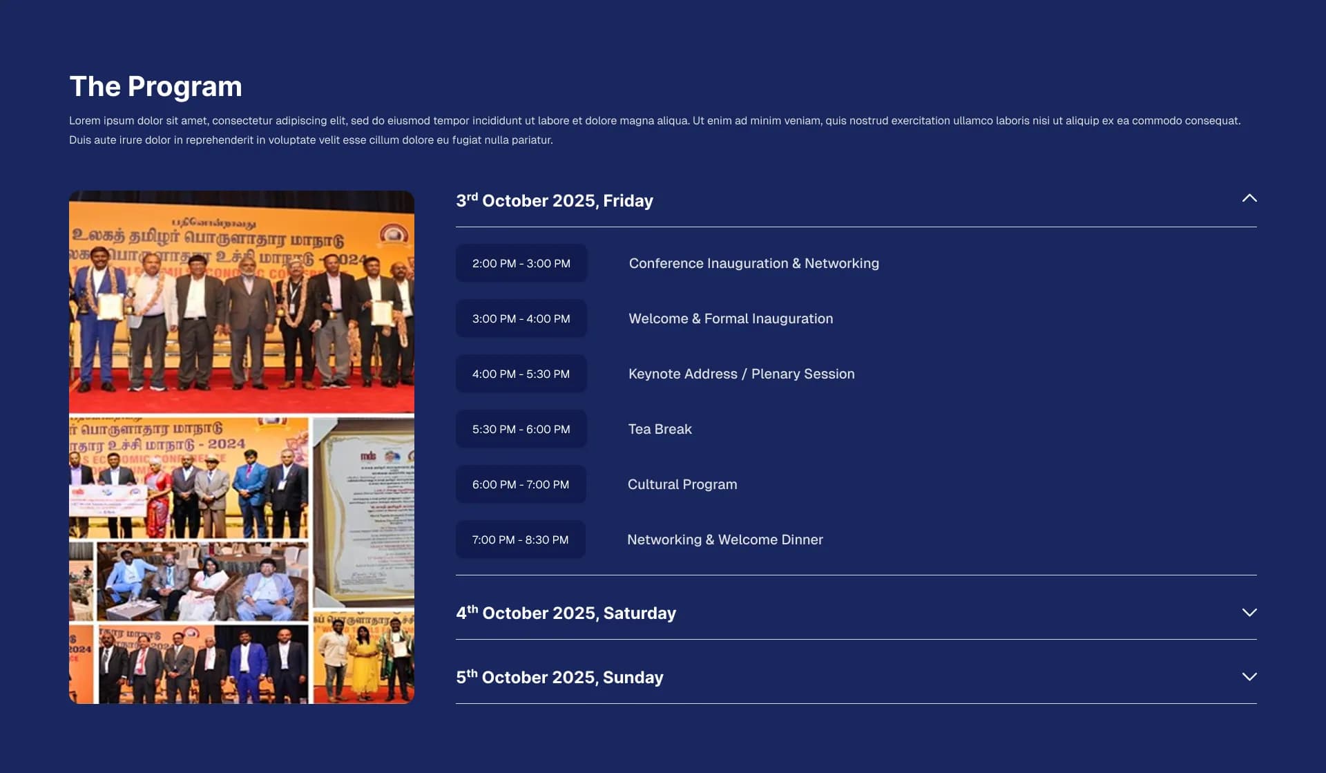
The biggest UX failure on event websites is an unreadable schedule. The About section sets the stage visually, leading smoothly into a highly structured Program section. I used a card-based timetable design that allows users to easily scan time slots, session topics, and locations without excessive scrolling or cognitive overload.
3. Establishing Authority & Backing
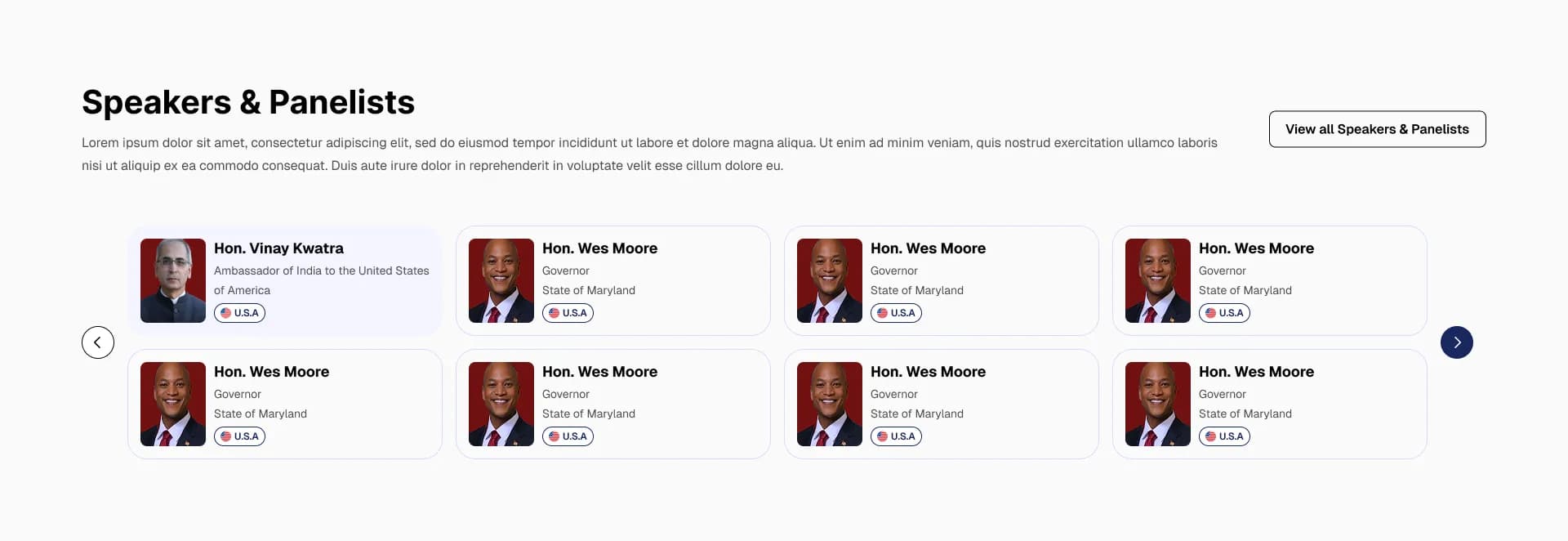
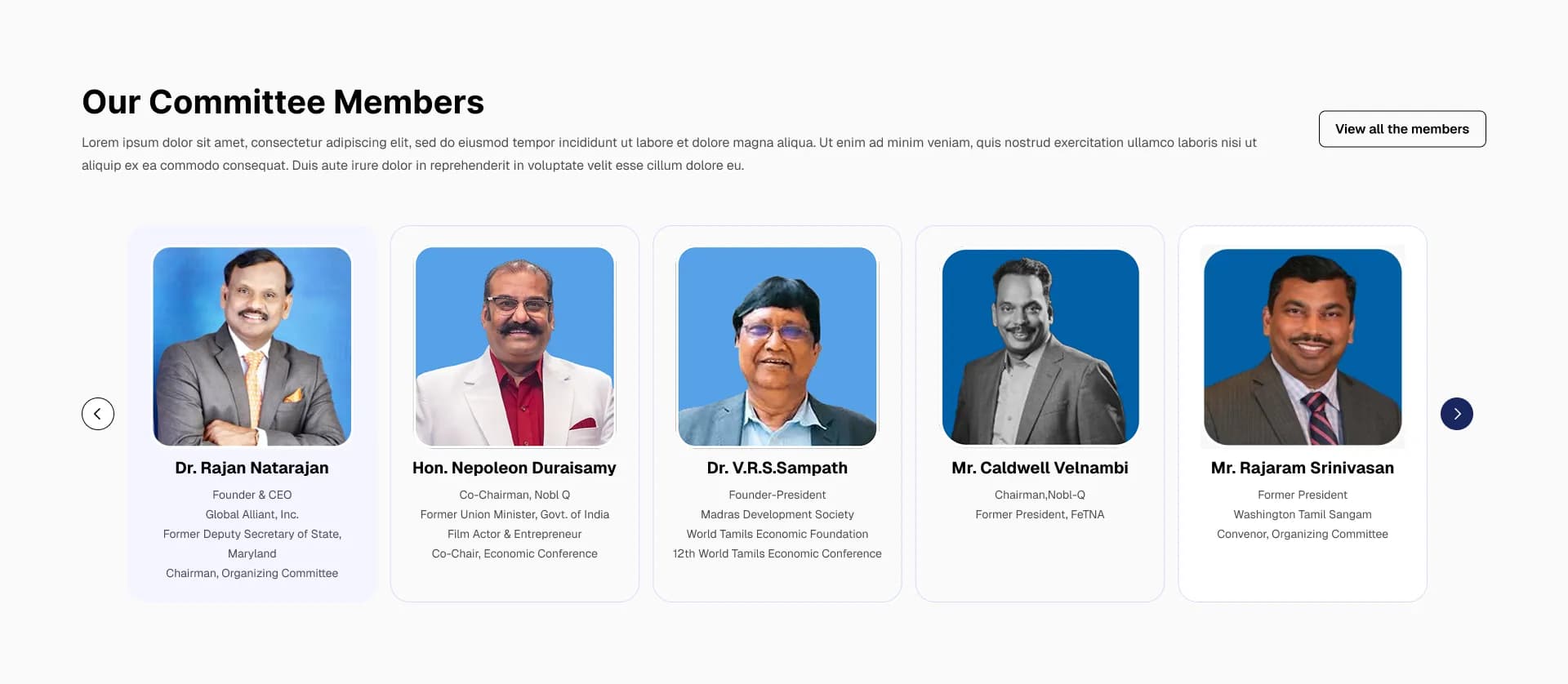
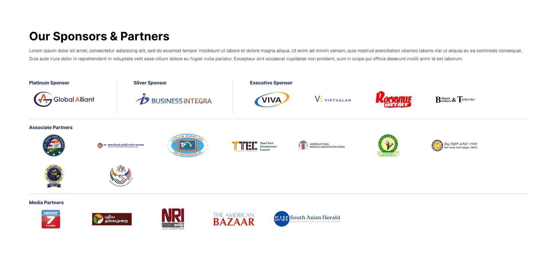
For an international conference, the credibility of the committee and the strength of the sponsors are paramount. The Committee sections use large, high-quality headshots with clear titles, establishing immediate human connection and authority. The Sponsors sections use a unified grid system to handle varied logo proportions gracefully, ensuring fair visibility.
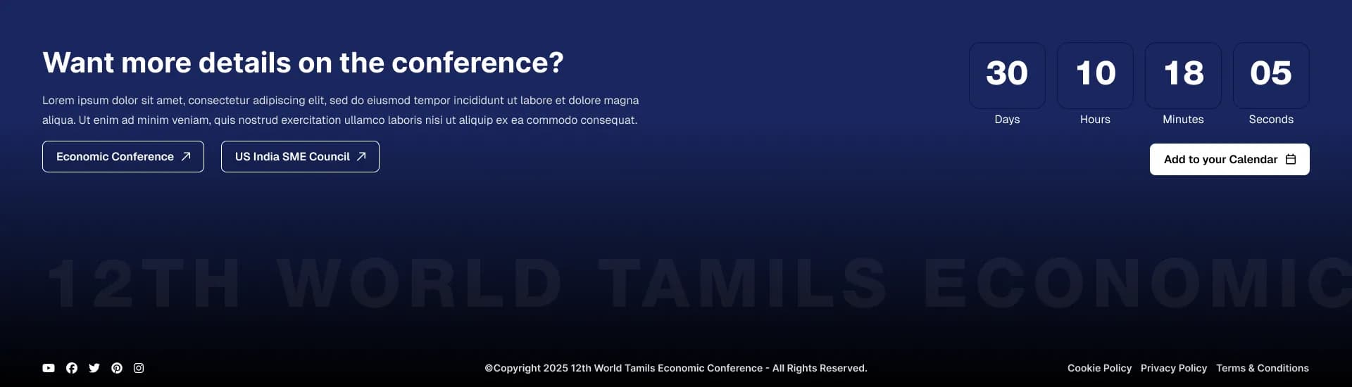
4. The Safety Net
The footer acts as the final safety net for users who have scrolled through the entire page. It cleanly organizes all secondary links, legal policies, and contact information, ensuring that users can always find their way without having to scroll back to the top.
Outcome & Reflection
Achieving full client approval on this design concept without extensive revisions proved the effectiveness of leading with a UX-first strategy. By deeply understanding the corporate audience, I was able to deliver a UI that didn't just look visually striking, but functionally solved the business's communication problems.
While the business partnership didn't finalize, this project remains a strong benchmark in my portfolio for how to execute high-end corporate web design efficiently.