
Trayinyas
A robust digital platform designed to unite cultural heritage, academic publications, and community events. Trayinyas required a design language that respected tradition while embracing modern usability standards.
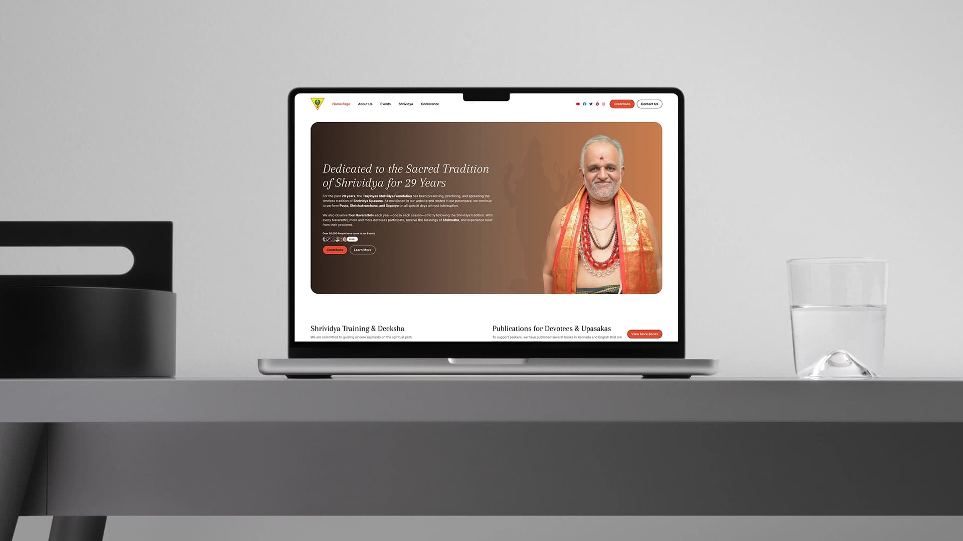
Project Context & History
During my time at UNIABROAD, Trayinyas approached us with a need to consolidate their diverse offerings, from academic conferences to cultural publications and university-level initiatives. Similar to the QCon initiative, the comprehensive designs I produced for this project were fully approved by stakeholders.
While the business deal ultimately fell through and did not proceed in its original form, the impact of my UX work remained. The organization adapted these exact designs for their current live website. Although the final implementation varies slightly from my pixel-perfect Figma files, the core design principles, layout structures, and user flows I established serve as the foundation of their live digital presence.
Design Philosophy
Designing for educational and cultural institutions requires walking a fine line. The interface must feel authoritative and deeply rooted in its heritage, yet it cannot afford to be clunky or outdated. My design system for Trayinyas prioritized:
Academic and cultural platforms are content-heavy. I established strict typographic scales and line heights to ensure long-form reading remained comfortable.
Events, conferences, and contributions needed to feel accessible, driving participation without overwhelming the user with logistical data.
Information Architecture
The most complex challenge on this project was the taxonomy. Trayinyas serves three fundamentally different user types, and the navigation had to guide each of them without the others feeling like they'd landed in the wrong place.
User Entry Points
Each user type has a distinct mental model — the IA was built around their natural first action.
Content Taxonomy
Mapping all content types to their audience and priority level before wireframing a single screen.
Academic Content
- Journal publications
- Conference proceedings
- Research submissions
- Author profiles
- Shrividya content
Community Content
- Upcoming events
- Conference listings
- Photo gallery
- Past events archive
- Video integration
Institutional
- Mission & vision
- University information
- Leadership team
- Contribution / donate
- Contact & partnerships
Deep Dive: Anatomy of the Homepage
The homepage of Trayinyas had to serve multiple audiences: academics seeking publications, community members looking for events, and prospective partners. Here is a breakdown of how the UI accommodated this complex requirement.
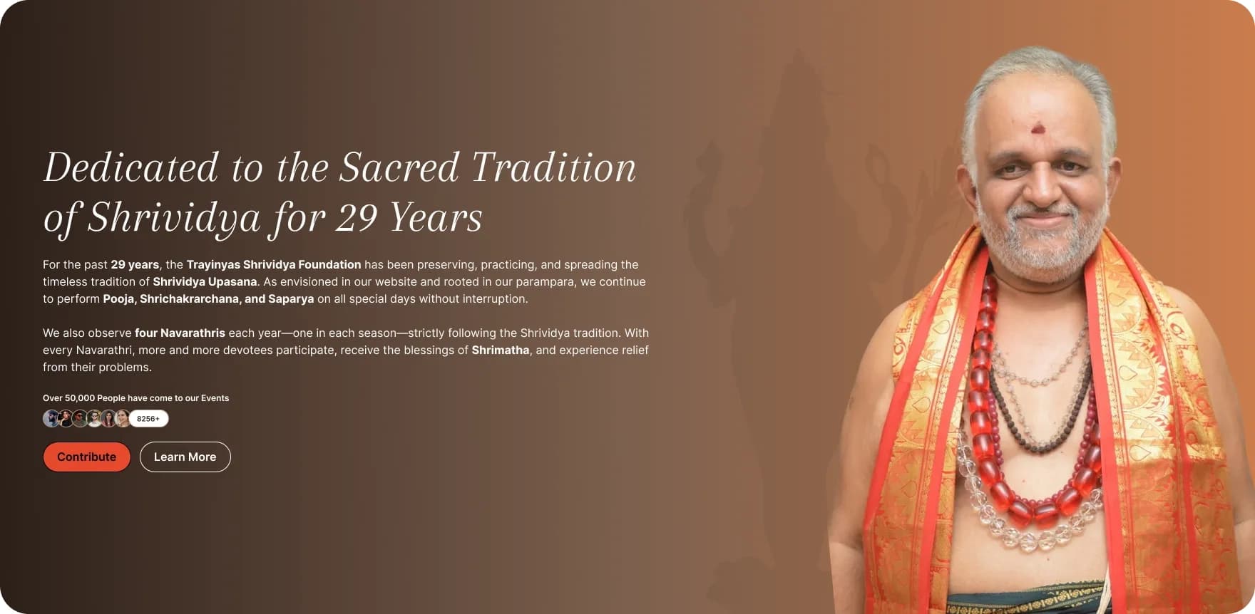
1. Navigation & The Hero Anchor
The Goal: Establish the institute's gravitas instantly.
The navigation handles complex taxonomy (Events, Publications, University info) through clean dropdowns to avoid cluttering the header. The Hero section uses evocative imagery and a commanding headline to set a respectful, authoritative tone.

2. Mission & Multimedia
The Goal: Communicate core values dynamically.
To prevent the site from feeling like a static textbook, I integrated a multimedia section directly below the mission statement. This allows users to passively consume the brand's vision through video, catering to different learning styles and engagement preferences.


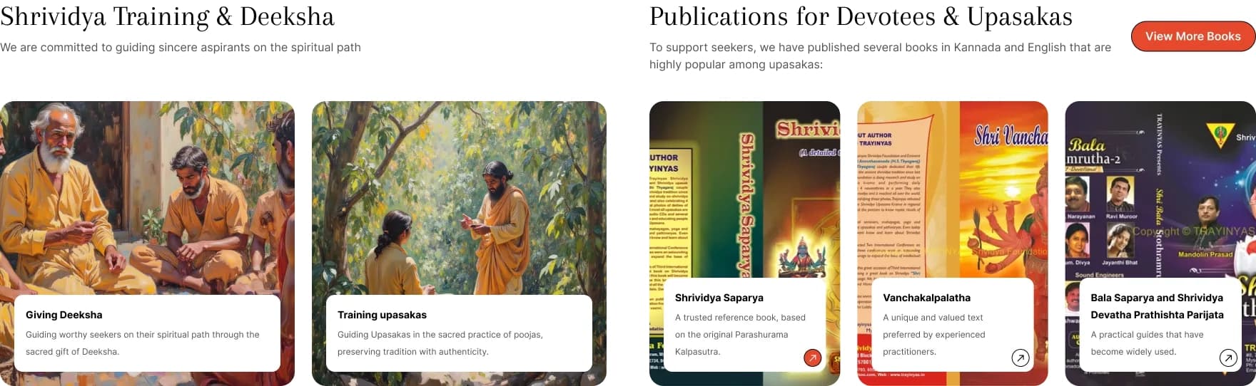
3. Academic Pillars
The Goal: Showcase academic authority efficiently.
Information about the University branch and Publications needed serious UX thought. I designed a card system for publications that highlights authors and abstracts, making it incredibly easy for academics to scan, preview, and dive into the literature.

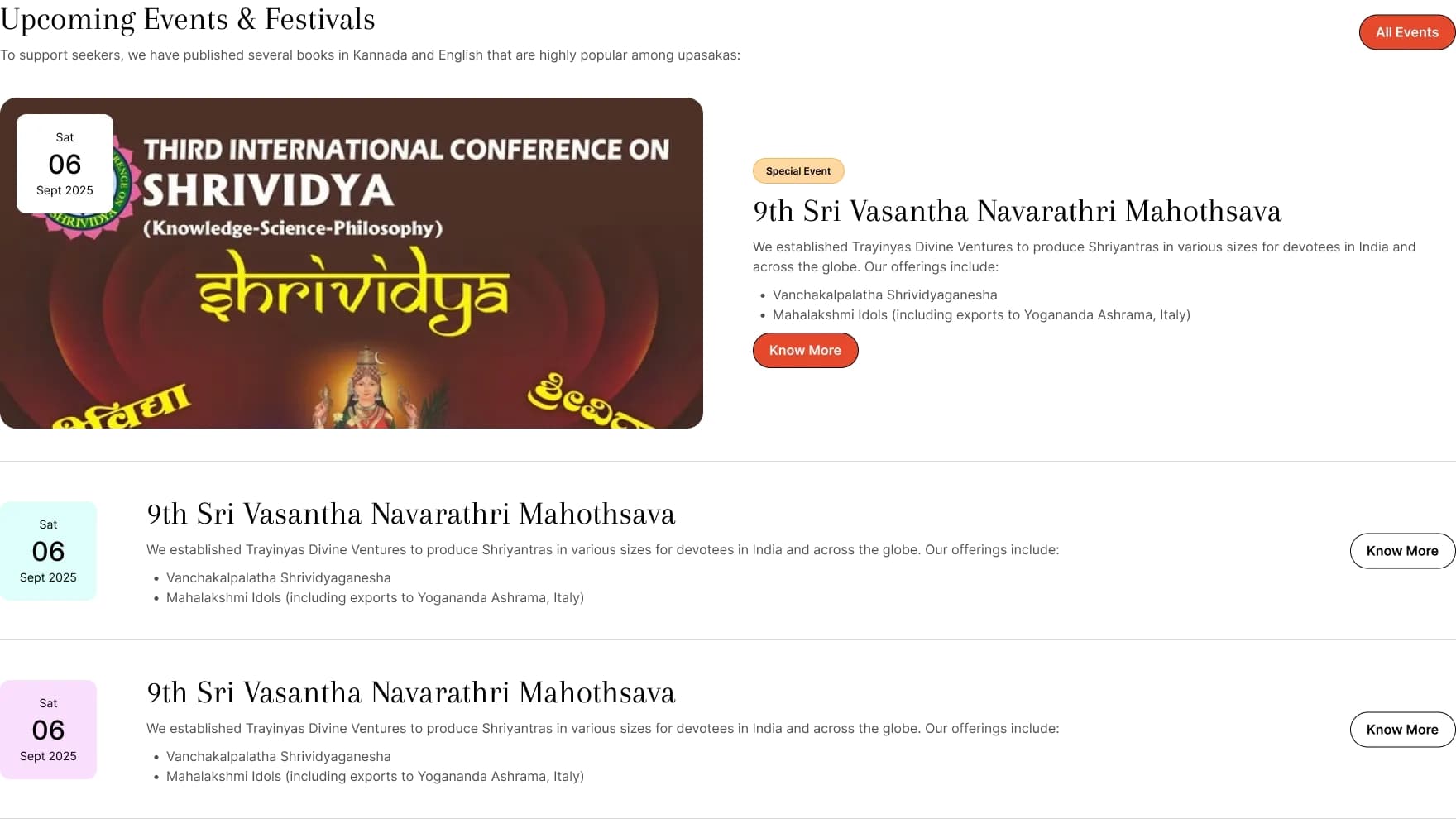
4. Community Engagement
The Goal: Drive attendance and showcase community vibrancy.
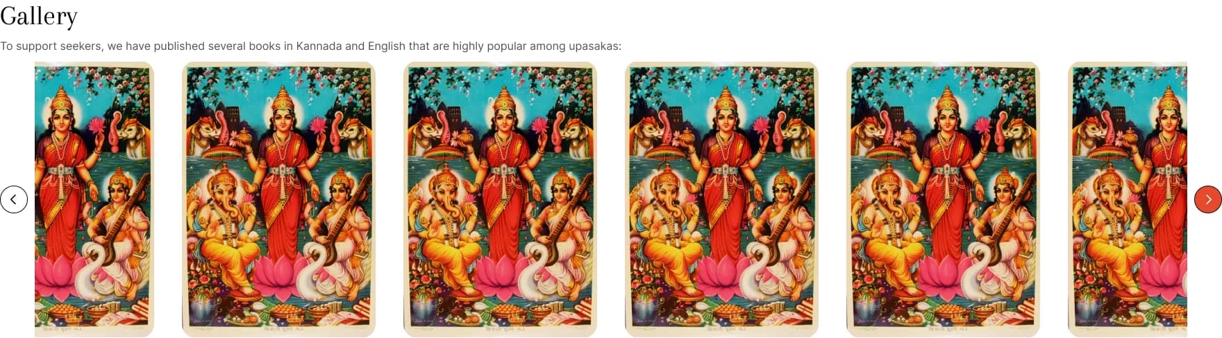
Events are displayed with a clear hierarchy of date, location, and topic, minimizing the effort required to RSVP. The adjoining Gallery section acts as visual proof of an active, thriving community, reassuring new users that the institution is vibrant and well-attended.
5. Conversion & Utilities
The Goal: Simplify support and sustain engagement.
The bottom of the funnel is dedicated to Contributions (donations/support). The CTA is stripped of distractions to maximize conversion rates. The expansive footer acts as a "fat footer," providing a comprehensive sitemap and essential contact details so users never feel lost.



Extending the Architecture
The complexity of Trayinyas truly emerged in its internal pages. I designed bespoke templates to handle specific content types elegantly, ensuring the user didn't have to relearn the UI across different sections.
Events & Conferences
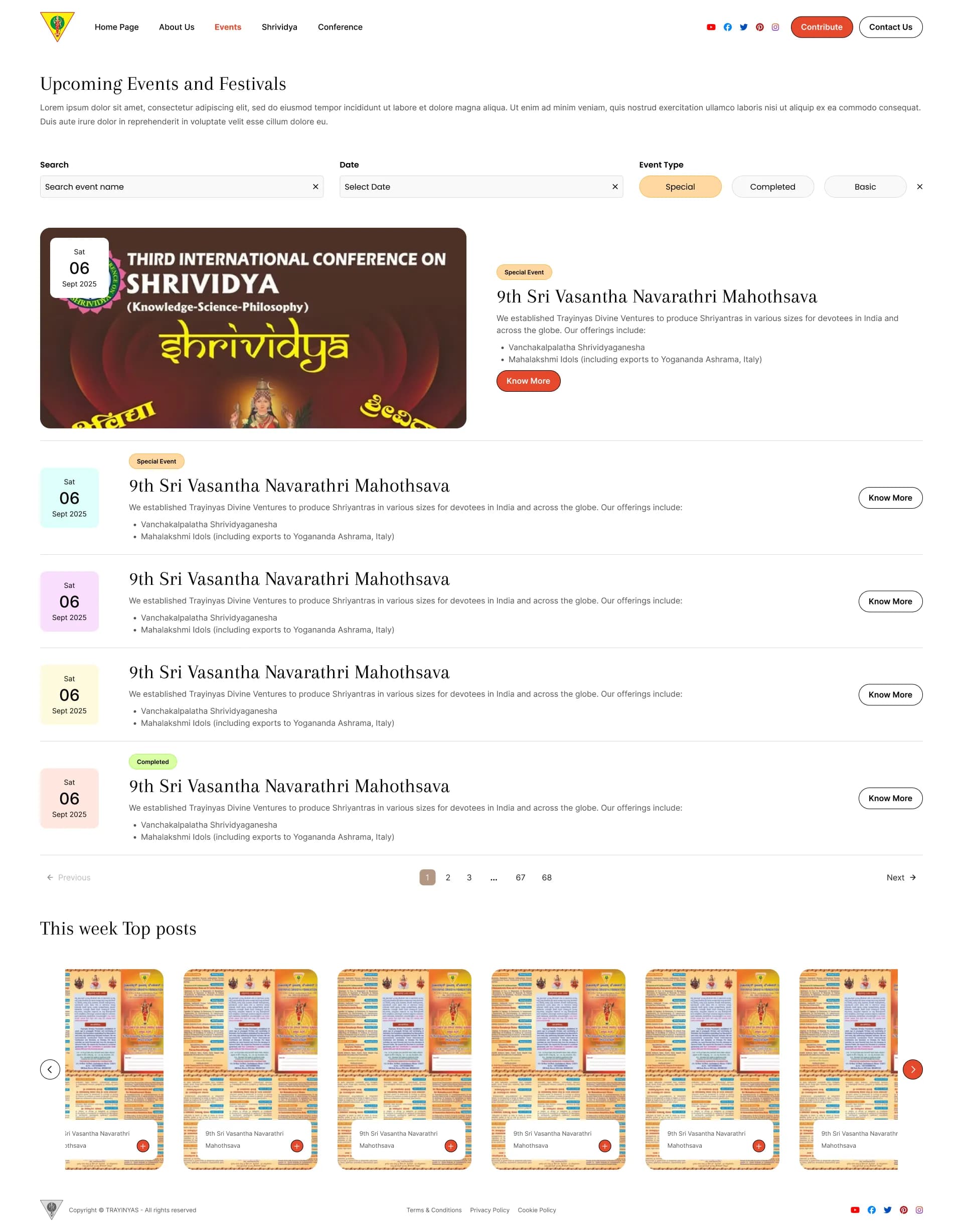
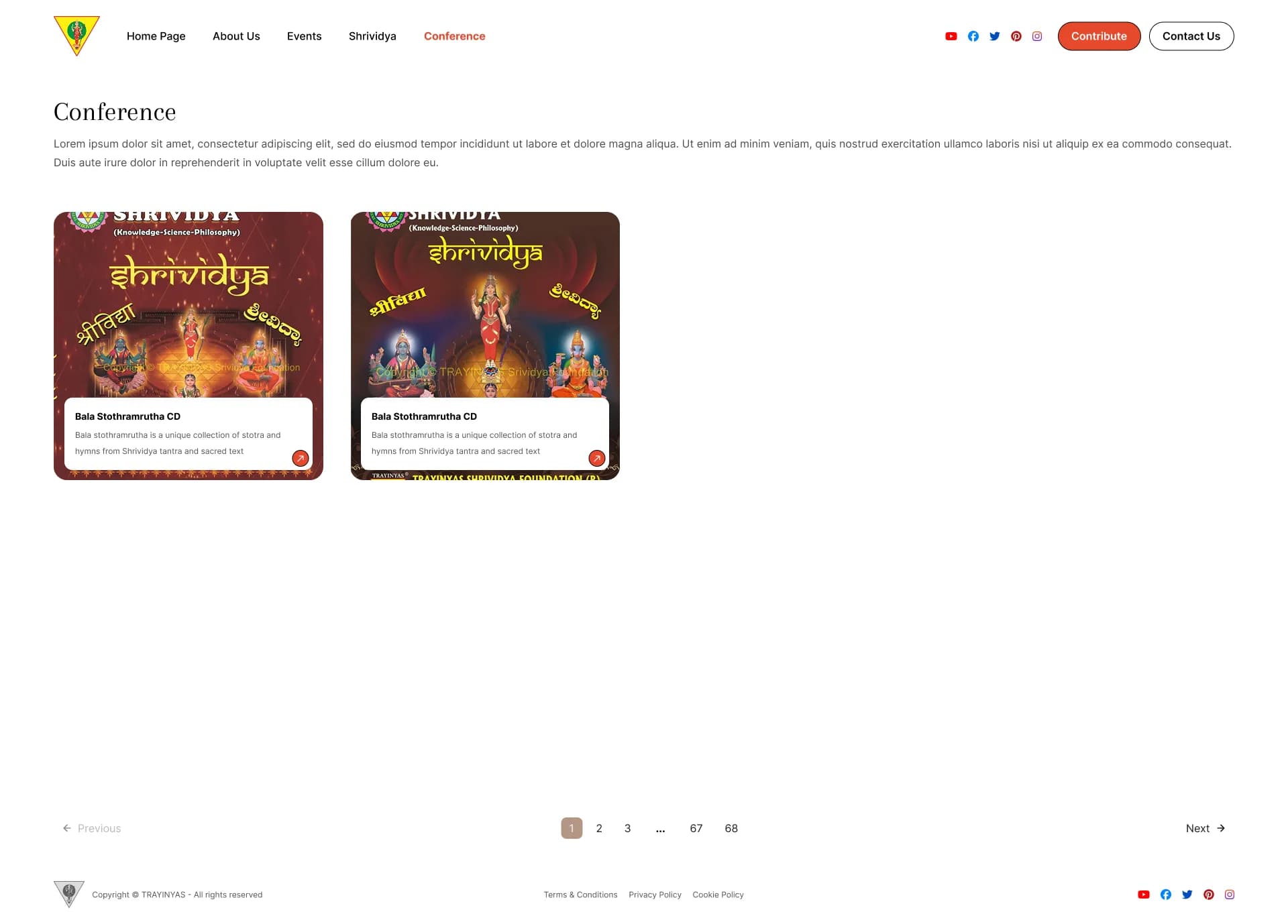
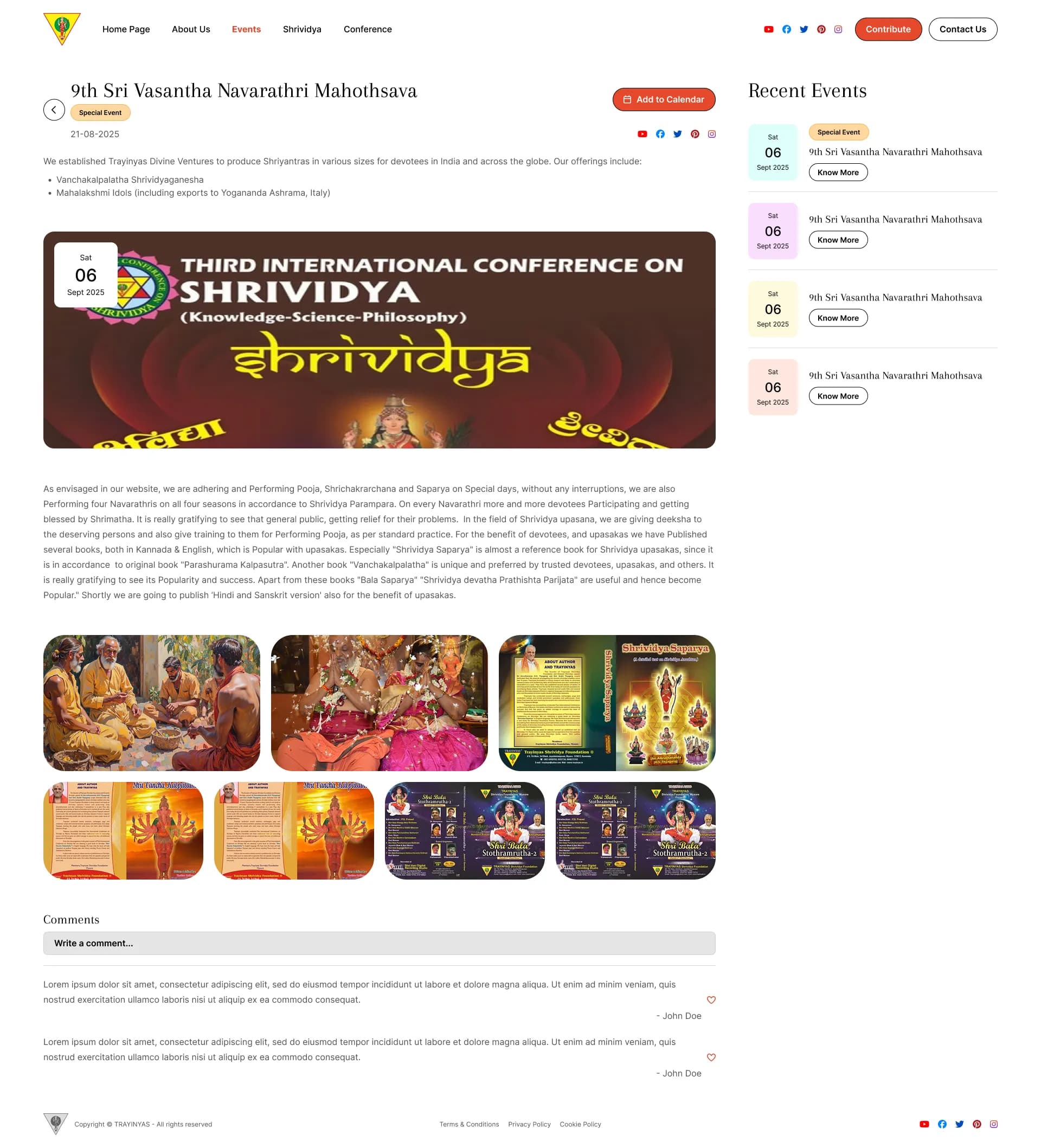
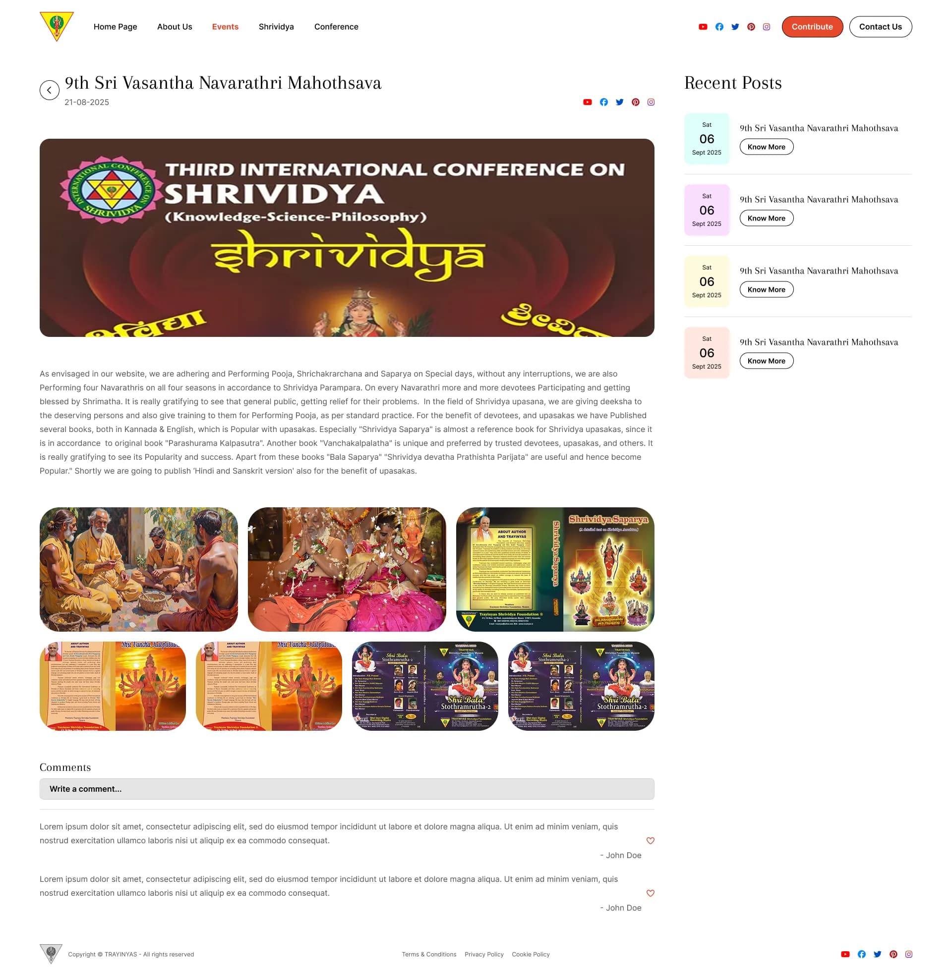
Listing pages for events needed rigorous filtering and sorting capabilities. The Conference and Event Inside pages were designed to surface vital logistics (schedules, speakers) immediately at the top of the page.
Content & Philosophy
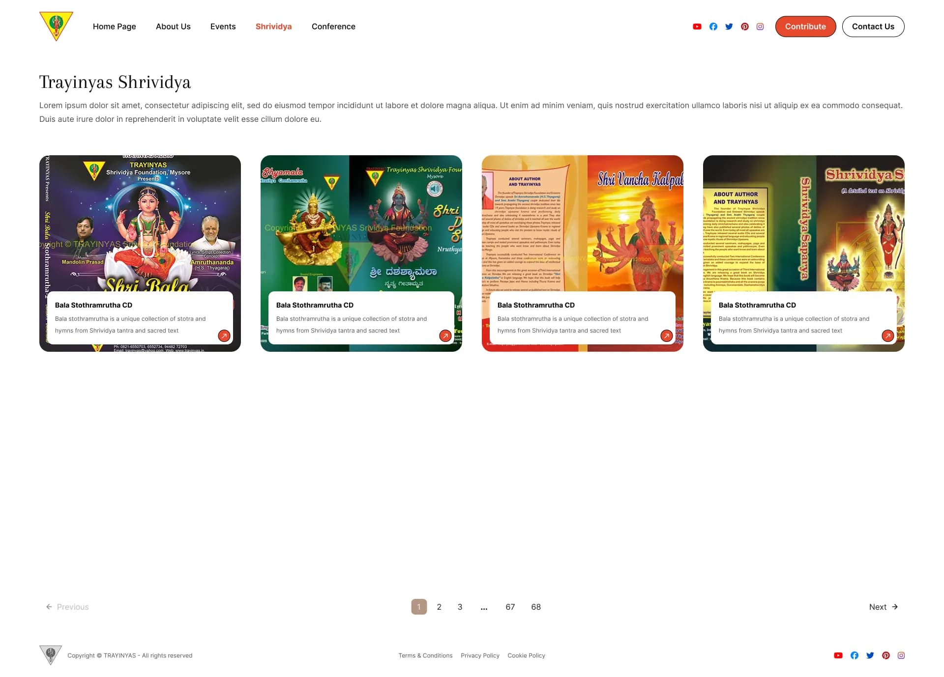
For deeper philosophical topics like "Shrividya" or general posts, the layout mimics editorial design. A narrow reading column ensures eyes don't fatigue while reading long academic texts.
Utility Pages
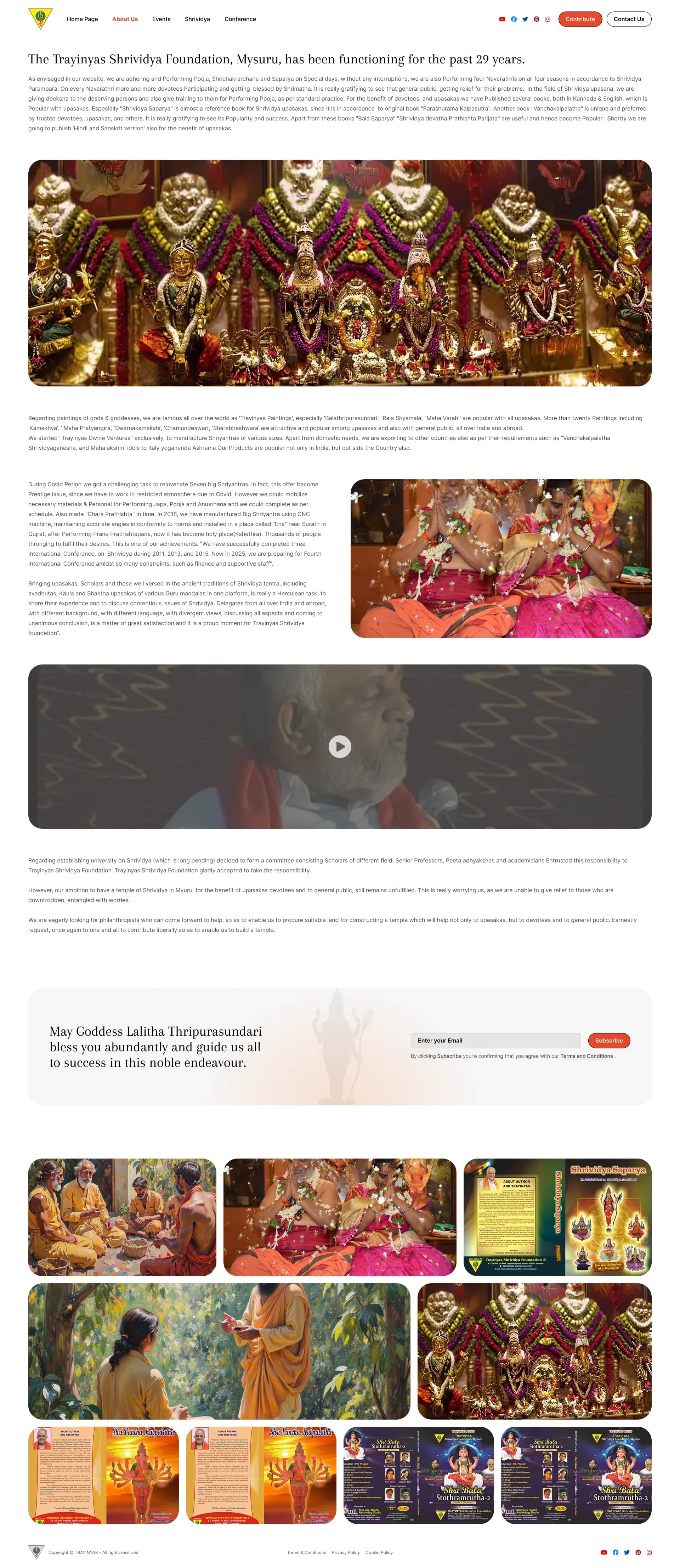
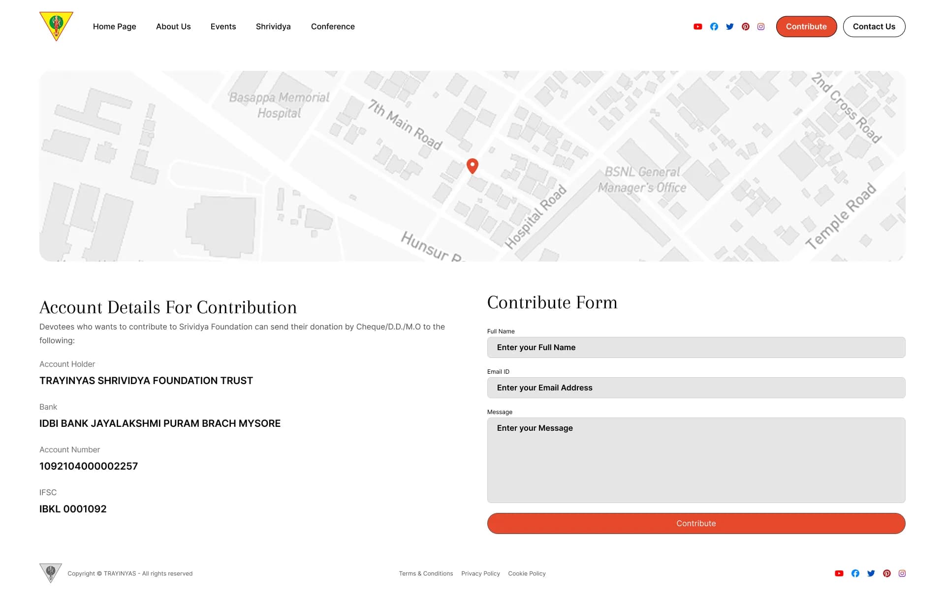
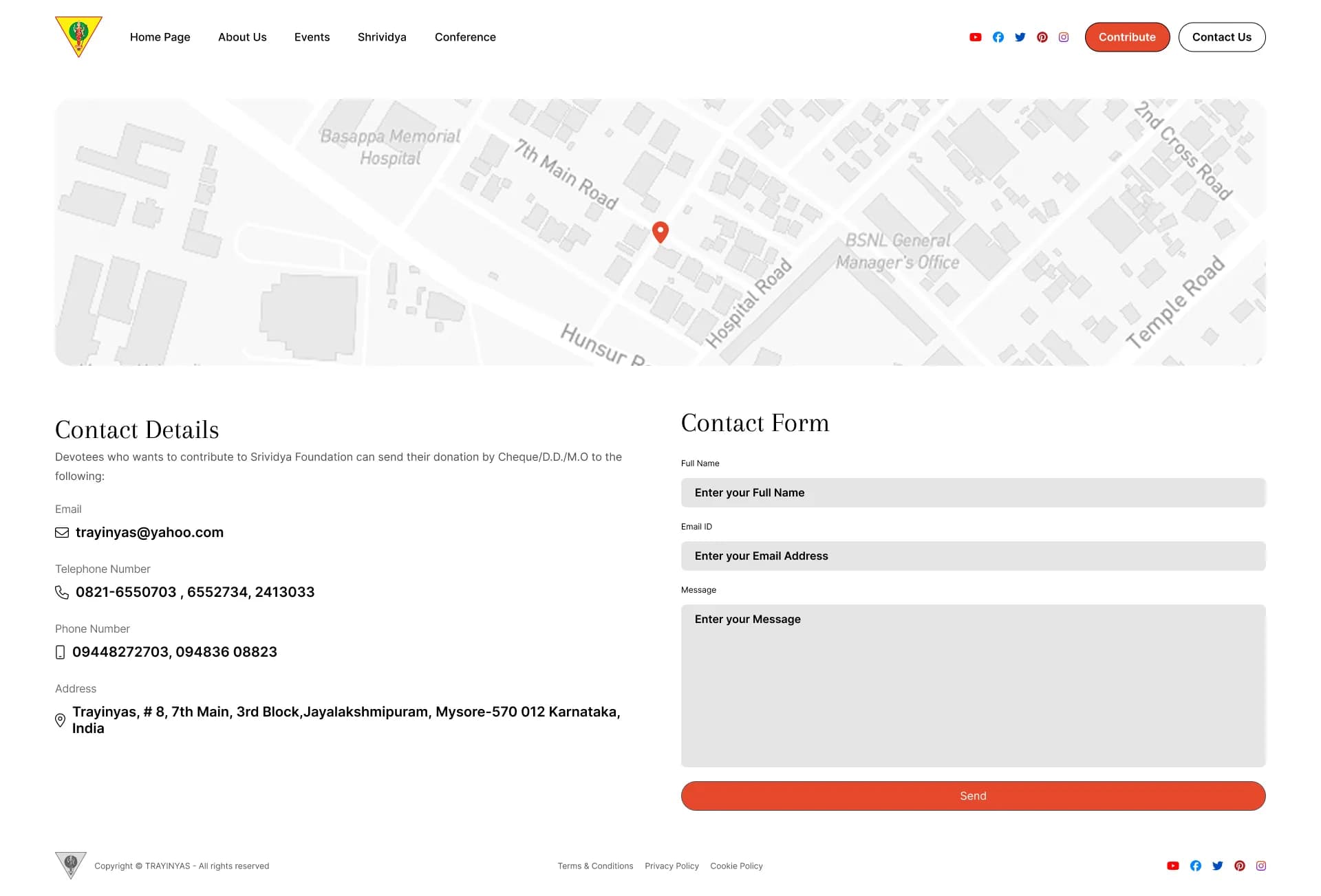
The About, Contact, and Contribute pages were designed to minimize friction. The Contribute page, in particular, was streamlined to remove any UX barriers for potential donors.
Interactive Prototype
Explore the full interactive Figma prototype below.
Legacy & Outcome
Good design outlives initial business negotiations. Although the original agency contract fell through, the architectural decisions, component structures, and visual hierarchies I established were so sound that they were carried over to the final, live product.
Trayinyas stands as a testament to creating robust UI/UX frameworks that organizations inherently recognize as the correct way forward, proving that strong usability principles always find their way into production.